Tuesday, December 1, 2009

Task 4: Book Review Graphic design the new basics


Graphic design the new basics


Graphic design the new basics by Ellen Lupton and Jennifer Cole Phillips, takes a fresh look at today’s visual language.
It explains the key concepts that inform design work, including point, line, plane, scale, hierarchy, layers and transparency. I recommend this book whether you are an experienced designer or someone just interested in learning more, it serves as a fantastic resource for the fundamentals of good design. It is a great way for students to learn the basic rules of design informed by contemporary media, theory, and software systems. Through visual demonstrations and concise commentary, the book shows how to build interest and complexity around simple relationships between formal elements of two-dimensional design, and explains key concepts of visual language that inform any work of design, from a logo to a web site.

James White


James White


James White is a very talented, experienced designer and visual artist from Nova Scotia, he is 31 years old and has been working as a fulltime graphic designer since 1998. His style is innovative and spectacular. By day he works as a designer for an agency where he creates websites, identities, corporate materials and various print pieces. He uses his time outside work to create his own personal art

“I was the kind of kid that got excited when I would see the NBC Special Presentation logo appear onscreen while watching television, because it inevitably led to Star Wars or Superman. It was that feeling I wanted to capture in my artwork, which led me to a retro-cosmic style directly inspired by network promo animations from the 70s and 80s, namely anything done by NBC.” - James White

“My workflow is rather simple. I wrote a very simple program in Flash that allowed me to create random assortments of shapes that I export to a postscript file so I can edit them in Illustrator. From there I will clean up the exports, add gradients, and use brushes to bend my shapes into unconventional combinations. Then I port them into Photoshop one by one where I can overlap them, lay down colors, lighting effects, textures, etc. “- James White

I love the usage of colour throughout his works they seem almost from another world or time, they are amazing.

“Learn your tools and programs inside and out but always remember that art comes from your mind, not the keyboard or mouse. Think about what you love and draw inspiration from that.”- James White


Andrea kang


Andrea kang

Andrea kang is an artist living and working in providence, Rhode Island. Andrea kang dedicates her time to illustration and character design; she is also a toy designer. The stylised simplicity of Andrea kang’s illustrations and character design is a welcome and refreshing change from the loud and brash ‘throw everything in with the kitchen sink’ style approach. Currently, kang is working as a graphic designer with a local Rhode island- based magazine, ‘Providence’, as well as designing toys, participating in group shows and exhibitions.“With vector you always end up with a more refined image and definitely a more finished and crisper look”

Andrea kang is lending her illustrative skills to a new collaborative project with scarygirl creator, Nathan jurevicius.
I enjoy Andrea kang’s work it’s sweet and simple, with cute toy-like characters. I especially like the illustration with the tree made from owls.

Nathan Jurevicius


Nathan jurevicius


Nathan jurevicius is a freelance illustrator who is widely known for his wonderful online graphic novel and game creation. Born in South Australia he grew up surrounded by art and design. He moved to Melbourne after he graduated with a bachelor in design in 1994, then soon after he set himself up to freelance before moving to London and then Toronto, Canada in 2004. He has worked as a freelance illustrator and artist with many international companies and galleries. When starting an illustration, jurevicius will sketch out the bare bones of his work with pencil and paper first before transferring it to the screen. His most acclaimed project to date is scary girl, a psychedelic, dream-like composition of heartfelt stories and reinterpreted folklore based around a cute but slightly odd little girl and her giant octopus guardian.
I really like Nathan jurevicius’ work it’s interesting and alluring. It draws you into its own world; I love the vibrant colouring and quirky characters.

Wednesday, November 25, 2009

Task 6: Retro Graphic Design


Alex Trochut

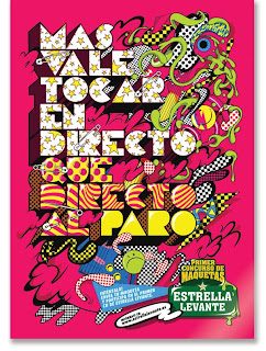
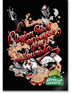
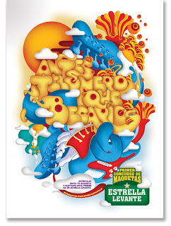
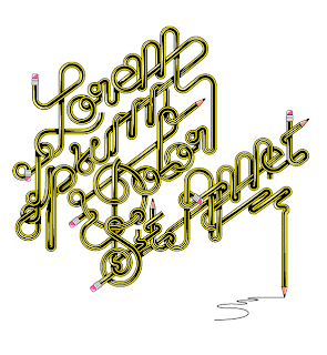
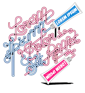
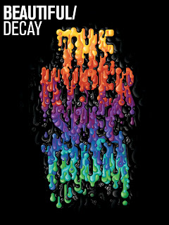
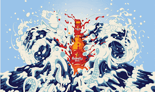
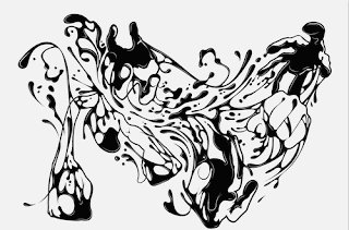
Alex Trochut is an incredible artist from Spain. He creates some amazing typography and illustration works. His layouts are remarkable fluid and clean. Alex Trochut’s illustrations, designs and typography challenge the very notion of minimalism with the philosophy that “More is more”. It’s rich with elegant, brilliantly detailed executions that convey indulgence and a lightness of touch, as well as control.
“I think the only thing that probably repeats is the choosing process, the rest is always changing, the way you add personality to the text, always balancing between being expressive and crazy and readable, form and content, is always changing, and trying to adapt as much as you can to visualise the content of the text through the visual level, and not only the meaning of the text itself.”
Alex Trochuts works are retro in the way that he uses the all kinds of display fonts from the 60s and 70s. The flowing of the words gives them the neon glow feel though he contemporises this by making the text come from objects like sauce bottles, pencils and toothpaste.


http://www.alextrochut.com/


Task 5: Graphic Designer RACHEL BONE


Rachel Bone is a designer, illustrator and artist who runs a small apparel business called Red Prairie Press, which sells hand-printed clothing and accessories for men, women and children. “I guess you could say I send ladies on adventures” with her illustrative style she creates open narratives throughout her work where the viewer is invited to narrate and finish the story. There is definite humour to her works and numerous meanings I enjoy the fact that you are given the title of the painting and the interpretation is up to you.
I Particularly like the unicorn one I love the image of the two women with the cone on one of their heads, it reminds me of being a kid and playing dress ups and pretending you’re in some magical place or that you are a horse or a unicorn, I find them very clever

Bembos Zoo


Bembos zoo is a book for all ages it’s inventive and eye catching.
The book's visual premise is the exceedingly witty manipulation of letters
It uses a serif font to create each of the animals in alphabetical order. The name of the animal transforms into the animal itself, it does this for the whole alphabet and is extremely entertaining.

Check out the website it’s definitely worth a look


Gemma Correll


I recently came across this design in a Frankie magazine and I thought it was great; I especially like the use of colour. These designs are from a U.K illustrator named Gemma Correll who says “I like drawing, pugs and coffee”. I love the patterns because there is so much to look at and they are all so fun and uplifting. Her use of typography is also great how her images make up the letters.


http://www.gemmacorrell.com


Task 3 Magazine Article Review


Whilst Reading the October issue of IDN (international designer’s network) I came across Danish graphic designer and artist; Emil Kozak. He has designed surfboards for Al Merrick and Kelly Slater as well as stuff for Nike and Vans. He also has his own clothing label, and even has an artist series MP3 player.


I found his work fresh and interesting he has serious messages wrapped in playful designs and I especially like his use of the whale. His website also has some other great artworks that he has done and is definitely worth checking out.


Monday, November 2, 2009

Task 2: Blog Review


A Blog site I found very interesting was a site called Typographica which is a review of typefaces and type books. It has work on it called Jeremy Pettis’ Alphabet Zoo, which has these amazingly interesting names of animals and he has given the animals names characteristics of the animal itself. I especially like the Zebra and jellyfish ones, as the illustration of the name resembles the physical characteristics of the animals. These illustrations are inspiring and great examples of good typography.

http://new.typographica.org/

http://new.typographica.org/2008/on-typography/jeremy-pettis-alphabet-zoo/