Wednesday, November 25, 2009

Task 6: Retro Graphic Design


Alex Trochut

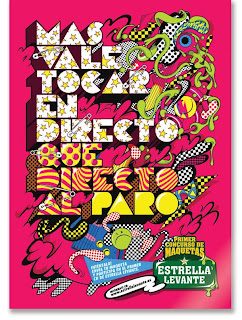
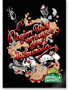
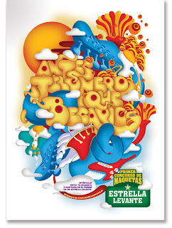
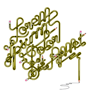
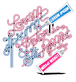
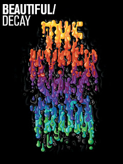
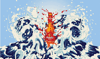
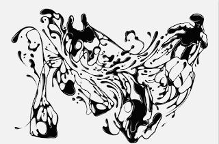
Alex Trochut is an incredible artist from Spain. He creates some amazing typography and illustration works. His layouts are remarkable fluid and clean. Alex Trochut’s illustrations, designs and typography challenge the very notion of minimalism with the philosophy that “More is more”. It’s rich with elegant, brilliantly detailed executions that convey indulgence and a lightness of touch, as well as control.
“I think the only thing that probably repeats is the choosing process, the rest is always changing, the way you add personality to the text, always balancing between being expressive and crazy and readable, form and content, is always changing, and trying to adapt as much as you can to visualise the content of the text through the visual level, and not only the meaning of the text itself.”
Alex Trochuts works are retro in the way that he uses the all kinds of display fonts from the 60s and 70s. The flowing of the words gives them the neon glow feel though he contemporises this by making the text come from objects like sauce bottles, pencils and toothpaste.


http://www.alextrochut.com/


Task 5: Graphic Designer RACHEL BONE


Rachel Bone is a designer, illustrator and artist who runs a small apparel business called Red Prairie Press, which sells hand-printed clothing and accessories for men, women and children. “I guess you could say I send ladies on adventures” with her illustrative style she creates open narratives throughout her work where the viewer is invited to narrate and finish the story. There is definite humour to her works and numerous meanings I enjoy the fact that you are given the title of the painting and the interpretation is up to you.
I Particularly like the unicorn one I love the image of the two women with the cone on one of their heads, it reminds me of being a kid and playing dress ups and pretending you’re in some magical place or that you are a horse or a unicorn, I find them very clever

Bembos Zoo


Bembos zoo is a book for all ages it’s inventive and eye catching.
The book's visual premise is the exceedingly witty manipulation of letters
It uses a serif font to create each of the animals in alphabetical order. The name of the animal transforms into the animal itself, it does this for the whole alphabet and is extremely entertaining.

Check out the website it’s definitely worth a look


Gemma Correll


I recently came across this design in a Frankie magazine and I thought it was great; I especially like the use of colour. These designs are from a U.K illustrator named Gemma Correll who says “I like drawing, pugs and coffee”. I love the patterns because there is so much to look at and they are all so fun and uplifting. Her use of typography is also great how her images make up the letters.


http://www.gemmacorrell.com


Task 3 Magazine Article Review


Whilst Reading the October issue of IDN (international designer’s network) I came across Danish graphic designer and artist; Emil Kozak. He has designed surfboards for Al Merrick and Kelly Slater as well as stuff for Nike and Vans. He also has his own clothing label, and even has an artist series MP3 player.


I found his work fresh and interesting he has serious messages wrapped in playful designs and I especially like his use of the whale. His website also has some other great artworks that he has done and is definitely worth checking out.


Monday, November 2, 2009

Task 2: Blog Review


A Blog site I found very interesting was a site called Typographica which is a review of typefaces and type books. It has work on it called Jeremy Pettis’ Alphabet Zoo, which has these amazingly interesting names of animals and he has given the animals names characteristics of the animal itself. I especially like the Zebra and jellyfish ones, as the illustration of the name resembles the physical characteristics of the animals. These illustrations are inspiring and great examples of good typography.

http://new.typographica.org/

http://new.typographica.org/2008/on-typography/jeremy-pettis-alphabet-zoo/